Figma: The secret to successful design collaboration
In the past, there were often disagreements between designers who worked together on projects because they had little opportunity to really create something together. Why? Lack of collaboration opportunities in tools or features to keep everyone up to date on ideas and developments. The fact is that a lack of real collaboration has led to inevitable missteps in projects. It has happened more than once that someone has worked on a design for a long time, only to realise in the end that an error was made right at the beginning or, in the worst case, an error was even duplicated. All available tools to date lacked user-friendliness. This has changed.
Interested in working together?
I look forward to hearing from you.


Figma: The design tool of our choice

Collaboration
A promising approach: Everyone involved at one table
Collaboration is the most valuable, time-saving option that software tools like Figma can offer. It allows staff to work on the same project at the same time and stay updated on all the changes that are being made.
Figma is an all-in-one design tool based on real-time collaboration. You can work on the same design sketch at the same time and split responsibilities efficiently. This way, everyone is up to date on the progress of the project at all times. The activities of each team member are displayed in real time, as if they were all sitting at a table or in a studio. In the team, you can easily do joint design critiques, review a specific design sketch and follow co-workers or the moderator. Worry-free versioning means that no status is ever lost. Everyone can see who has adapted what and when, and can retrieve a previous version if necessary.
To view the current status, the editors or programmers each receive a link to the design. For example, if parts of a design are already released for development, the next phase can begin while other design areas are still being worked on.

With Figma, I can get feedback from the client and see their wishes directly in this prototyping, instead of looking for comments in screenshots as I used to.
Quick editing via styles, components & auto layout
User experience design is an iterative process in which the design is always in motion. If you only have to create styles, components and entire modules once in all variants and can use them several times, this saves an enormous amount of time.
In UX design tools like Figma, most basic elements are set in styles such as colours, typography and even effects. This ensures easy, fast and consistent work.
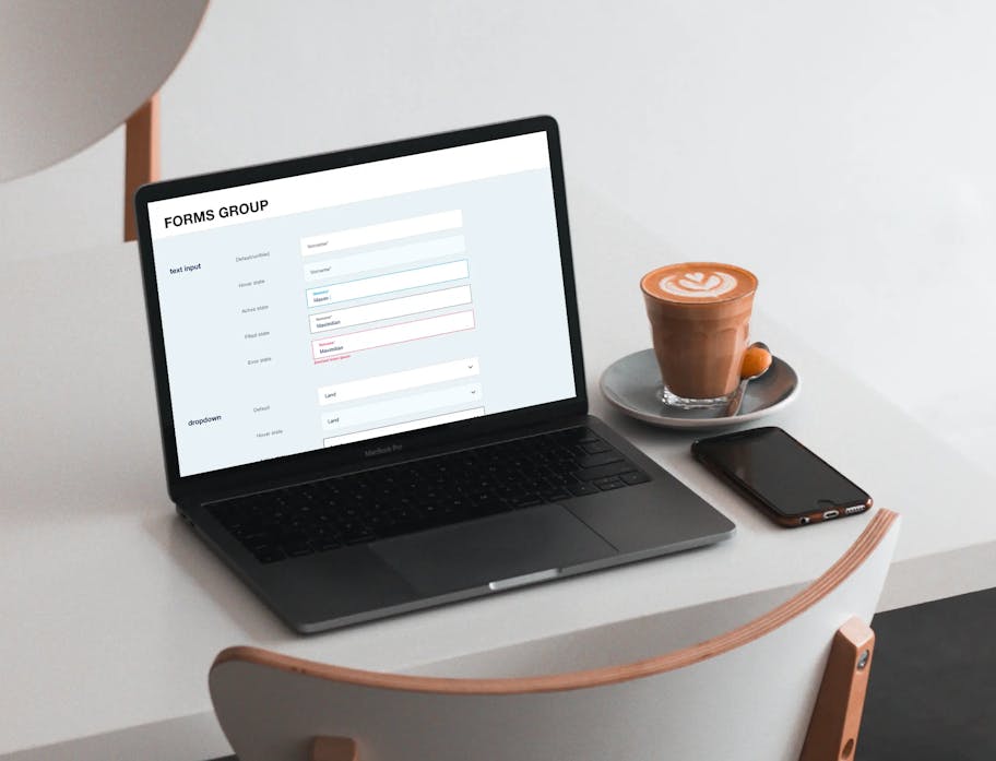
Components are building blocks for any design project. These are collections of elements assembled in a reusable way, e.g. buttons, forms, navigations, maps, cells and overlays. Component elements such as text content, colours and images can be adjusted in the Inspector. A button component can be duplicated several times, with different content and styles.
We see Figma’s auto-layout function as a real ‘secret weapon’. If you design a larger component (also called a module or slice, depending on the CMS) such as an image-text module, you can create it as a component and easily insert it into texts using the auto-layout function – without having to adjust the spacing again and again. Different variants are possible for one component (e.g. image left|image right). With just one click, you can then swap the position of image and text in the design and quickly work with colour variations.

Design Library
For maximum consistency

Prototyping
Quick and easy prototyping
A separate tool for each design task – today a thing a thing of the past. With Figma, we finally have everything in a single document: All wireframes and design prototypes are online, and all elements used can always be found in one place.
Hovers and links are extremely important for testing UX designs early on. Are the clickable areas recognisable as such for the users? Can users easily find their way in a flow or are there positions where they get stuck? Without prototyping, we would not be able to identify this type of optimisation potential. With our prototyping, you get an early feel for how the website will ultimately behave.
Design Review
Design reviews are easy

Developer handoff
On to development
Designers and developers are the ones who transform ideas into a finished product. High quality is therefore indispensable in the collaboration within the team.
To enable better collaboration between designers and developers, Figma has created a function specifically for handover to developers. This allows designers to share a link with all developers involved in the project. Developers can retrieve measurements and styles, and download images and symbols from the project’s URL. A separate tool is not required for the developer handover: You simply open the corresponding files and switch to encoded mode.
With further plug-ins, such as Figma tokens, the handover to developers becomes even easier and they receive the most important codes directly in a JSON file.

Why our clients love Figma
Our clients are part of our team
Our recommendation
The Figma tool solves many of the problems in website development we have experienced in the past. Real-time communication and file sharing significantly increase project efficiency. With its features, the UX design tool has succeeded in convincing its users to switch their old design programmes because they now have everything in one.
Sometimes things can be simplified and still outperform the way teams have been working. For us, Figma is an extremely well-conceived, efficient tool for interface design that gathers all the experts virtually around one table to achieve even the most complicated design goals.
Interested in working together?
I look forward to hearing from you.


