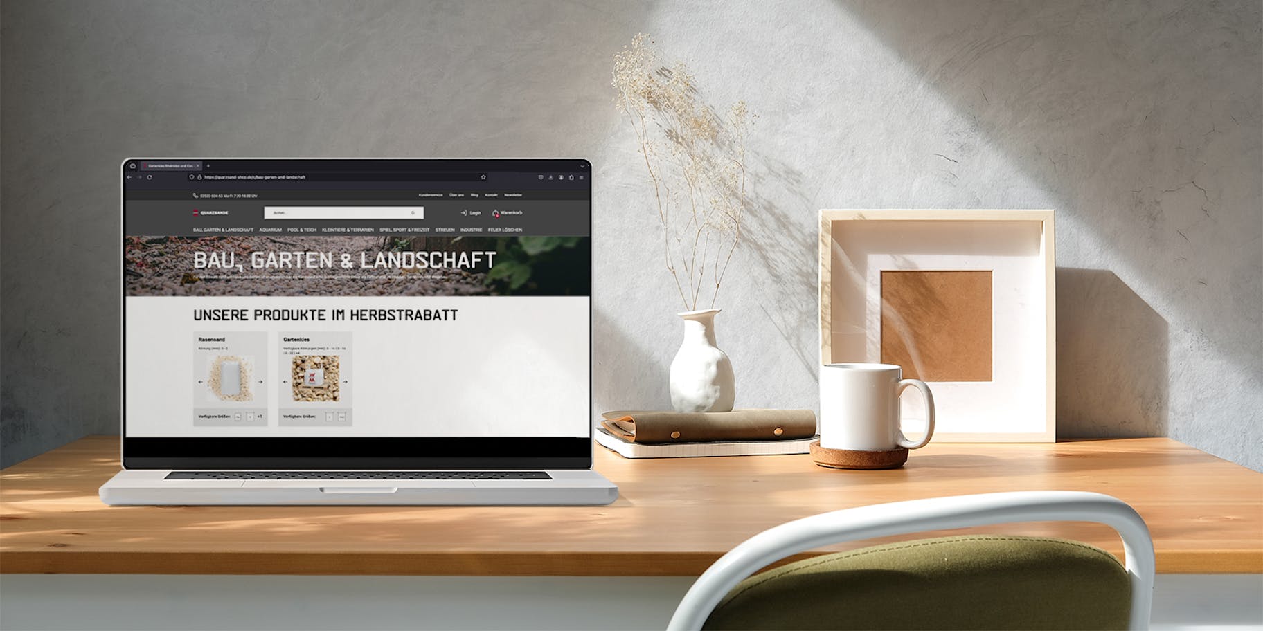
Wolff & Müller / Construction Group
Client
WOLFF & MÜLLER Quarzsande GmbH
Sector
Building materials industry
Technology used
Remix.run, Firebase, Crystallize, Algolia, Google Cloud Platform, Firebase, Brevo, Plentymarkets
Languages
German
Time required
6 months
Number of pages
650 pages, some 100 products
Frequency
21,000 page views/month

The client
WOLFF & MÜLLER Quarzsande GmbH is one of the leading manufacturers of mineral raw materials in Germany. With its plants in Haida and Quedlinburg, the company is also one of the largest producers of high-quality quartz sand for water treatment, foundries, construction chemicals, locomotive brake sand as well as for sports and leisure facilities.
The assignment
The aim was to develop a technologically high-performance solution with two dimensions: In the back office, the Quarzsande Shop employees needed to be able to work as automatically as possible. At the same time, the web shop had to be compelling in terms of UX and from the customer's perspective – while standing out visually from the competition.
Services
- Consulting
- Workshops
- Data flows & content mapping
- Structural concept
- Look development
- UX and UI design
- Illustrations
- Technical development
Best choice: Composable Commerce for the Quarzsande shop
The process
Achieving the goal together
With consulting, workshops, UX and UI design and technical development, we built a state-of-the-art and successful Quarzsand shop that helps the company sell and manage its products more effectively. Our close collaboration contributed to the fact that we were able to achieve the best possible result together openly and efficiently without the need for correction phases. Currently, the e-shop has also been linked to other online marketplaces such as Kaufland and eBay.

01 Joint Workshops
In an initial joint workshop, we took a close look at the functions of the current shop. What can be automated, what potential do we see and what can we imagine for the future?

02 Definition of requirements
Based on the first workshop, we defined the requirements the shop had to fulfil.

03 Requirements review
As finalising the contract took a little more time, we got together again and reviewed the requirements. In doing so, we defined them in more detail.

04 User flows
The user flows for the various target groups were defined (B2B users, B2C users, non-logged-in users, guest users).

05: Data flow & content mapping
A shop relaunch is a good opportunity to improve the appearance and functionality of your online shop.
Data flow refers to the path your data takes during the relaunch. This includes the migration of product information, customer accounts, order histories and other relevant data.
Content mapping refers to the mapping of content to the appropriate areas in your new shop.

06: Mood board / Style development
Development of the look: basic style, typography, colours, ...

07: Wireframing
UX design: visualisation of the structure and functions in a click dummy

08: Finalising UI design
Finalisation of the user interface design for desktop and mobile.
Product overview
Finding your destination quickly
The product overview is optimised so that users can find the information they need easily and intuitively.
The products are clustered according to 8 applications and can be easily filtered. The product tiles provide important information on available packaging sizes and grain sizes.

Today's product overview:
Products clustered by application on one page; filter and sorting options; product tiles with illustration, price/kilo and packaging units

Previous product overview:
No singular overview, products spread over several pages; no filter options; product images not informative
Product detail - fact-driven and structured


The focus here is on the comprehensible presentation of product data and simple selection of the appropriate product variant, supported by an organised layout and easy readability.
Application detail - emotive and informal


The focus in the application area is on the emotive communication of interesting facts about the respective application. Here we use a freer, looser layout and increasingly use the WOLFF & MÜLLER font. In the applications, the user will find links to more detailed blog posts and, of course, to the products for this application.
Product detail
Informative and easy to configure
The clear layout of the product detail page shows all the essential details at a glance.
It is now easy to switch between individual product variants so that users can easily access their desired product configuration. A quantity calculator helps define quantities for selected products.

Today's product detail:
Top benefits at the start; simple product selection including supporting quantity calculator; concise 'add to cart' button

Previous product detail:
No product selection, as each grain size and packaging unit had its own page; text-heavy; no quick overview
Sold!
The clearly organised check-out offers a variety of shipping options. Thanks to a guest check-out, products can also be ordered without registration.

Shopping basket: View of all products in the shopping cart with editing options, price and payment options, support chat offer

Check-out: Address selection & new address, various shipping options, telephone number for shipping company, cancellation request, voucher code

Login screen for non-logged-in users: Simple password-free login via magic link, as an alternative traditional login with password, guest check-out offer, direct link registration

Guest check-out: e-mail enquiry, personal data, various shipping options, telephone number for forwarding agent, drop-off request, voucher code
Technology
What is Composable Commerce?
Composable Commerce offers a flexible and scalable solution that enables companies to customise their e-commerce platform to individual requirements and create a seamless shopping experience for customers.
The integration of specialised services, in addition to the underlying standardised technology (Composable Architecture), enables customers to find and buy products quickly and easily. At the same time, Composable Commerce offers seamless handling of the purchasing process by integrating all necessary functions such as shopping cart, payment and shipping into the platform.
For the company, this means greater flexibility in adapting the platform to individual requirements and a faster market launch of new products. The use of specialised services also increases the reliability and scalability of the platform and therefore helps to increase efficiency.

Composable Commerce tech stack for the WOLFF & MÜLLER Quarzsand-Shop
Your contact


