Buff Medical Resort / Health Resort
Client
BUFF MEDICAL RESORT
Sector
Health & Wellness
Partnership
Since 2022
The client
A new premium health centre was created on the shore of Lake Constance, which is a fusion of a 5-star hotel and a clinic. The innovative health resort combines wellbeing and fasting with medical services. The unique geographical location directly on Lake Constance – combined with first-class medical care and exclusive premium services – contributes to making the health centre a superb experience.
The assignment
The client, a successful Swiss hotelier, was looking for a consultant well before the opening of the resort – to provide support with market analysis, brand strategy and positioning and, based on this, to develop a logo/brand and an international, interdisciplinary marketing strategy on its own initiative.
The services
- Consulting
- Brand positioning
- Naming
- Branding
- Corporate design
- Digital marketing strategy
- PR/media concept development
- Event research
The brand
BUFF MEDICAL distinguishes itself through innovative healthcare solutions that are customised to the specific needs of patients.
The brand stands for the highest quality standards and reliability in its products and services – gaining the trust of patients and medical professionals alike. Moreover, Buff Medical prioritises cutting-edge medical technologies and ongoing research to remain at the forefront of medical development. The brand is closely associated with the founder and visionary and is synonymous with his excellent reputation.
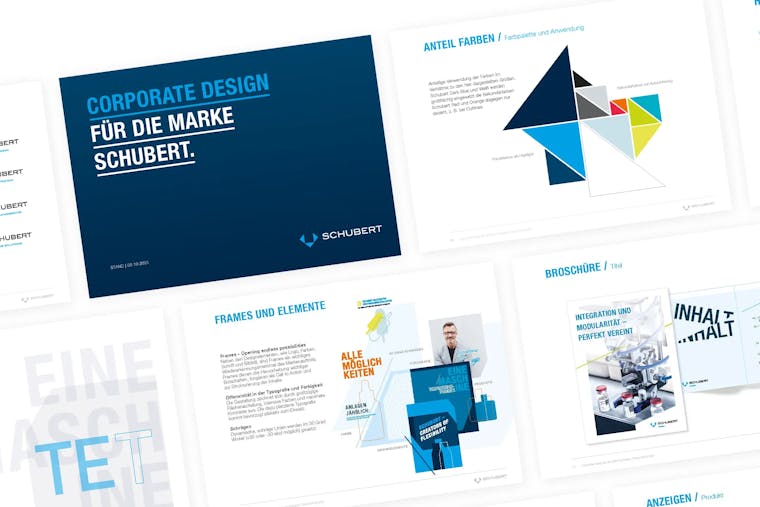
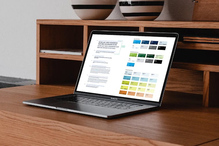
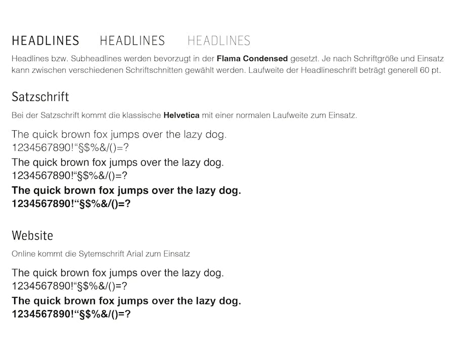
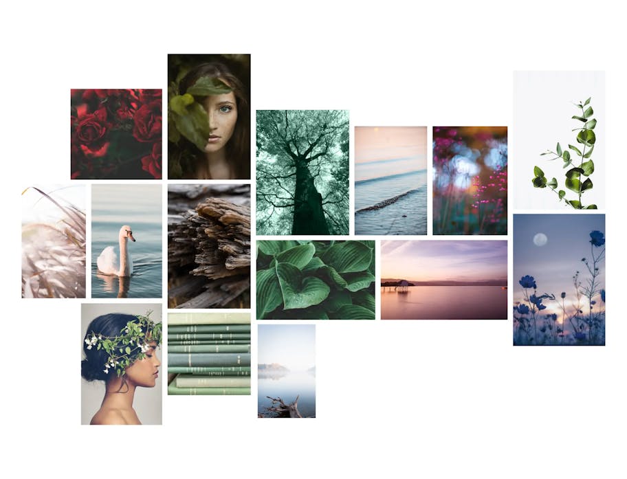
Corporate Design Manual
It is aimed at all BUFF MEDICAL RESORT employees and all those involved in the production of communication materials. The design guidelines and guidelines are binding – this is the only way to position a standardised visual profile in the long term.
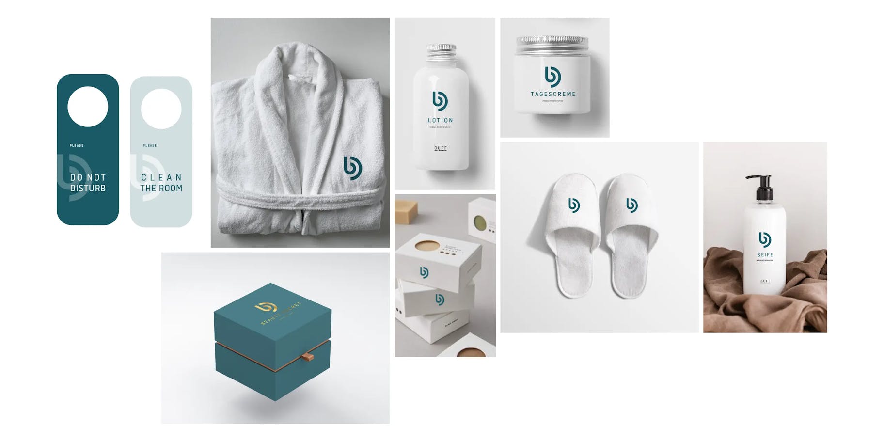
The logo
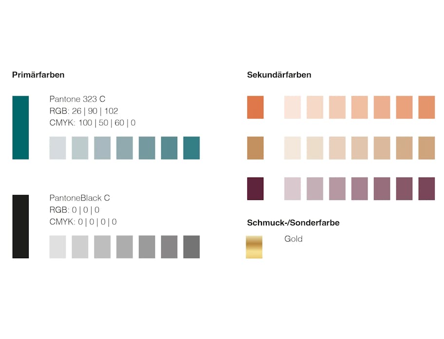
The colours
The typography
The imagery
Branding business stationery

Clear, elegant design: A minimalist approach with a lot of free space conveys a sense of high quality and expertise.
Your contact