Schubert / Packaging Machines
Client
Gerhard Schubert GmbH
Sector
Machines and systems engineering
Partnership
Since 1973
The client
Schubert is a leading manufacturer of packaging machines and offers customised packaging solutions for a wide range of industries. Schubert’s packaging boasts the highest quality and efficiency, and offers customers the opportunity to package their products safely and effectively. Schubert relies on innovative technologies and a customer-focused approach to provide its customers with the best possible result. With many years of experience and a strong focus on innovation and quality, Schubert is a reliable partner for packaging solutions.
The assignment
A company as large as Schubert needs to convey a unified and consistent brand image to the outside world. Since a multitude of digital interfaces had been developed by various agencies and service providers, a digital design system needed to be created that would uniformly define the design. To this end, designers from the Ruess Group took the lead in defining the user experience style guide, including coordination with the individual disciplines, to ensure that all requirements and needs were met.
Services
- Development of the design system in Figma
- Continuous optimisation and expansion
Why a UX Design Guide is necessary
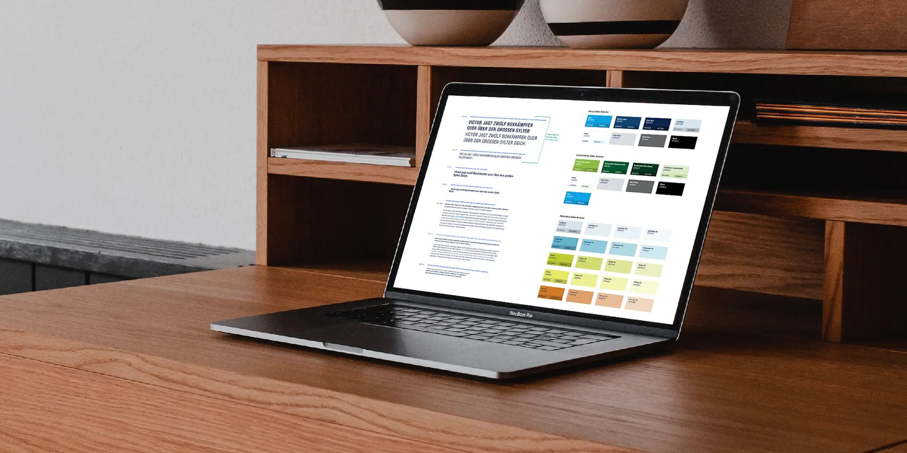
Definition of colours & fonts

Different colour systems were developed depending on the use (group website, sustainability website, machine interfaces, etc.). There are three font families that can be used, depending on the application: Helvetica Neue Condensed and Helvetica Neue as the main font, the Arial Narrow and Arial system fonts for e-mails, and Liberation Narrow and Liberation for the Linux-based environment of the machine interfaces.Verschiedene Farbsysteme je nach Einsatz (Group Website, Nachhaltigkeits-Website, Maschinen-Interfaces ...) wurden entwickelt. Für die Schriften gibt es je nach Einsatz auch drei Schriftfamilien, die genutzt werden können: Helvetica Neue Condensed und Helvetica Neue als Hauptschrift, für E-Mails die Systemschrift Arial Narrow und Arial sowie für die linuxbasierte Umgebung der Maschinen-Interfaces die Liberation Narrow und Liberation.
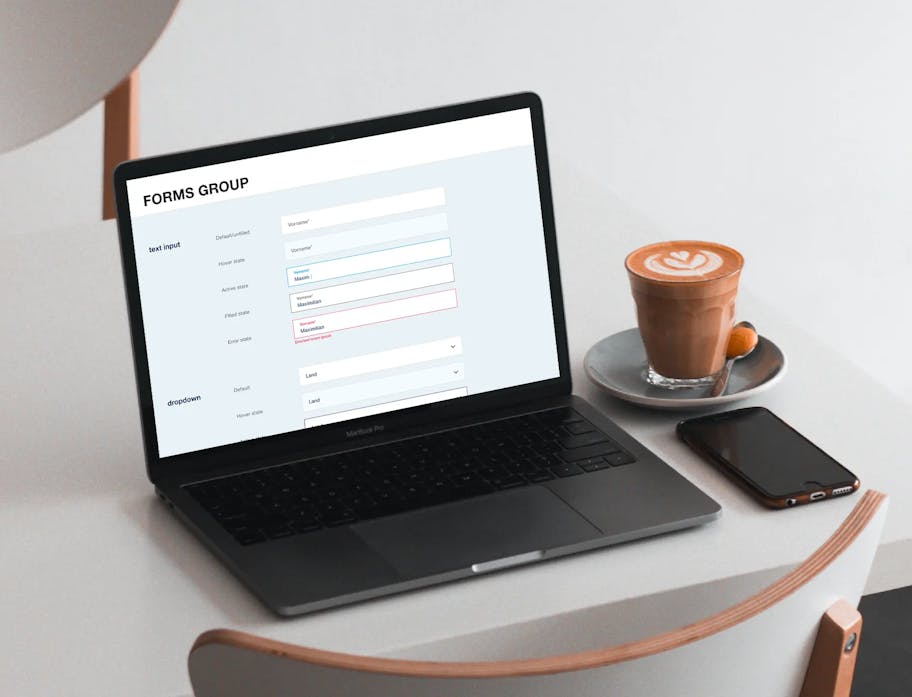
Definition of buttons & links


Interaction Elements

Definition of numerous interactive elements for light and dark mode: text input, dropdowns, checkboxes, radio buttons, toggles, pagination, comboboxes, listboxes, treeviews, context menus, dialogue messages, pop-ups, etc.
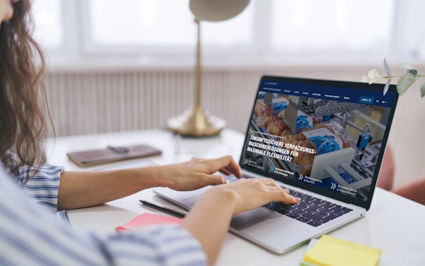
Examples of websites

Schubert Group Website

Schubert Mission Blue Sustainability microsite

Schubert Careers microsite

Schubert System-Elektronik corporate website
Care portal
Colour definition for charts, dark & light themes

· Standard view in dark mode

Expert view in dark mode

Expert view in light mode
Your contact
